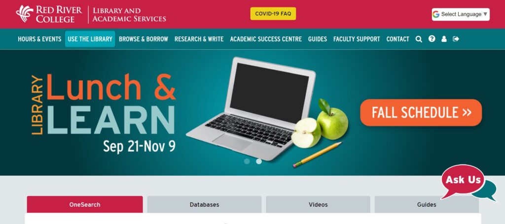
Library Website Built with Users in Mind
Last spring, if you were to look at our old Library website, you would be looking at a somewhat dated “Library-centric” web, with two Academic Support departments, and new features, i.e., LibAnswers and LibCal, tacked on. We knew our web site was due to be reorganized, and at the same time given a fresh look and feel. As with many changes, the summer period gave us a window of opportunity when there was a break in classes. How could we take advantage of this opportunity and create a new-look website designed with our users in mind?
User-centric Design
We began by looking toward user-centric design principles that have been the cornerstone of effective web design for decades. Some web sites look great, but are completely ineffective to their users. We wanted to avoid this, and achieve a greater level of usability. So, we began by studying users.
On our Library web site, the greatest metric we had were analytics of what users did on our site. Where did they go? What did they click on? Generally, top traffic resources on our website were: OneSearch, A-Z List, Ask Us, the Academic Services landing page, Tutoring, Supports for Students, Library Subject Guides, Workshops, Self-Directed Learning Modules, Stem Centre, and College Readiness.
We took this information as a starting point, and began to develop two personas that represent Library web users: Average Student User and Average Instructor User.
Built with Library users in mind
PERSONA 1:
Average Student User wants to…
 Discover and borrow Library materials.
- Browse for Academic Supports.
- Access digital resources such as electronic articles and databases.
- Discover and attend Library and ASC workshops.
- Refer to a course-related subject guide.
- Access Tutoring services.
- Access a Library service.
- See when the Library is open.
- Find study space.
- Book AV equipment, laptops and chargers.
- Locate an instructor-recommended resource.
- Ask a question or get help.
- Learn how to cite.
PERSONA 2:
Average Instructor User wants to…
 Discover Library materials and resources for planning, research
and teaching.- Set up course reserves.
- Access a Library service such as ILL or Digitization.
- Refer their students to Library or ASC workshops.
- Refer their students to specific ASC resources.
- Request materials for their courses and students, i.e., Suggest a Purchase.
- Book AV equipment, laptops and chargers.
- Find copyright information and help.
- Get Academic Integrity advice and assistance.
- Ask a question or get help.
Redesign Process
With these two personas in mind, we began a three phase process.
Phase 1: Content reorganization. A cross section of library staff were brought together to make decisions about the web site organization and hierarchy. With our user personas in mind, staff individually performed card sorting exercises and compared results. This group also investigated other academic Library web sites. The final product was a new main menu structure, built with users in mind.

Phase 2: Home page re-design. With our users in mind, a second working group reviewed the information and features on the current Library home, and formulated a plan to build a more modern and concise home page. This group also took the time to review other academic websites, and recommended features which we could adopt for our new home page.
Phase 3: Overall web site re-skin. A smaller team of experts worked on a new header, footer and colours for the new site. The goal was to give the new Library web site a fresh look, new colours, and improvement in accessibility.
A cornerstone of this project was to involve many people from across Library and Academic Services. Each one of the above teams consisted of different people, thus enhancing our staff’s ability to influence decisions made in the new web site design. Their awesome contributions are reflected throughout the new web site.
Technical Details
The website is built on the LibGuides CMS platform by Springshare. Pages on this platform are responsive (mobile-friendly) through the Bootstrap framework. We have also taken advantage of other Springshare platforms such as LibAnswers, LibWizard and LibCal. We needed to add custom CSS and JavaScript for many of the features we built, however the Springshare platform allows for a sufficient level of customization.
The site is built with accessibility in mind, and accomplished through accessibility features built in to the LibGuides platform, and attention to detail in the added customizations. Our current home page tests as 100% accessible in the Google Lighthouse tool.
Looking Forward
We are planning focus groups this fall, where we hope to further determine how our patrons use our web site, and gauge the effectiveness of our new site design. In doing so, we expect slight revisions to the current web site, and an update of our personas.
Story by Mark Nelson ~ Library Systems Specialist

